Table of Contents
Candlestick
What is Candlestick?
As per candlestick meaning, it is a type of special price chart used for ensuring accurate Technical Analysis. The given price chart is known for displaying the opening, closing, low, and high prices of some security for a fixed period.

The term & concept is known to have originated from the rice traders and merchants in Japan. They used a similar concept of tracking Market prices as well as daily momentum. The concept was already in use hundreds of years ago, before it became famous in the modern era in the United States of America.
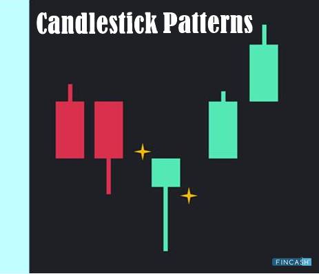
The wider portion of the candlestick is referred to as the “real body.” This section of the price chart is known to tell the investors, whether the particular Close Price was lower or higher than its opening price (in colors of black or red in case the stock was closed at a lower value, and in colors of white & green in case the stocks closed at a higher value).
Understanding the Basics of Candlestick
The shadow of the candlestick is known to reveal the daily high & low values and how the same compares to the given open & close scenario. The shape of the candlestick might vary depending on the given relationship between the closing, opening, high, and low values of the given day.
Talk to our investment specialist
Candlesticks are known to reflect the impact of the sentiments of the investors on the subsequent security prices. The given concept is mostly utilized for predictive technical analysis for determining when one should enter or exit the given trades. The charting mechanism of candlesticks is known to be based on the technique that was developed way back in Japan during the 1700s. Candlesticks also serve to be an ideal solution for trading some liquid Financial Assets including futures, foreign exchanges, and stocks.
The presence of long candlesticks in white or green color is known to indicate the availability of strong buying pressures. This is helpful in indicating that the price of the given market is bullish. On the other hand, the presence of long candlesticks in red or black colors is known to indicate the availability of significant selling pressures. The given chart explains that the chart is bearish in nature.
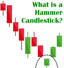
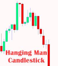
A typical bullish pattern for the candlestick reversal pattern –known as a hammer, is known to be formed when the price would move significantly lower after the opening rates, and then rises to the high at the closing time. The similar concept of the bearish candlestick chart is known by the name as the “hanging man.” The given candlestick patterns tend to have similar appearances to that of the square lollipop. These patterns are typically utilized by traders when they are attempting to select the bottom or top in the given market.
All efforts have been made to ensure the information provided here is accurate. However, no guarantees are made regarding correctness of data. Please verify with scheme information document before making any investment.


